Yes, I know - you've been waiting for it - well its always better late then never [and I'm so thankful for that saying as it too often applies to me...] the
DesignEx 2011 review.
I had warned that I didn't think DX this year was overly spectacular but I think the snippets I have to share are worth the wait, lets see what you think...
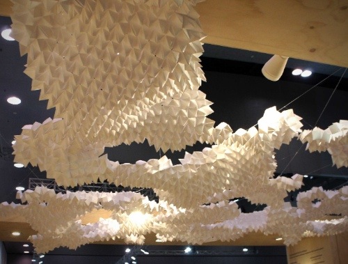
[above: the amazing paper installation in the ceiling of the DIA/Colourways stand which won best stand award for thier category]
This year there were some small stands that caught my eye with their creative displays or quirky goods.
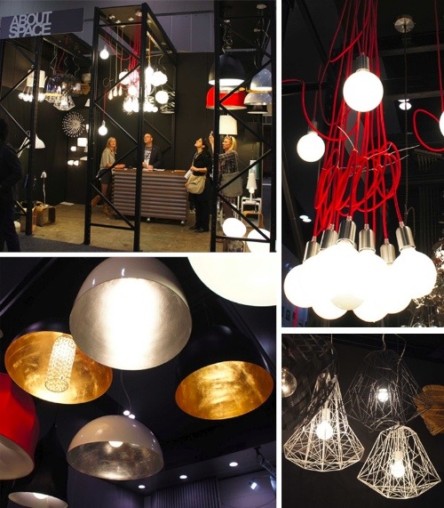
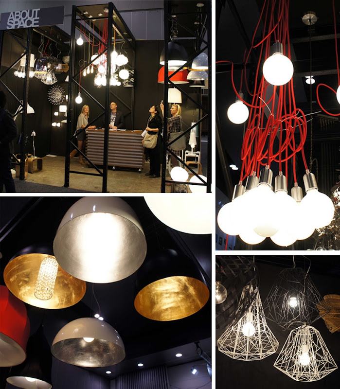
About Space [above] - a small lighting and furniture store in Fitzroy Victoria - had a compact stand that was chock full of great lighting pieces. Right on trend were the industrial pendants with luxurious metallic interiors, the angular web like lines of the Lineare range and the Muuto inspired Cluster with their exposed bulbs and coloured cords.
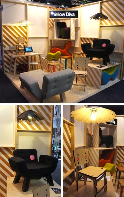
And how perfectly packaged was the
Yellow Diva stand - compact but making a statement through their furniture pieces against a backdrop resembling the inside of large crate or perhaps an area under construction. Simple vignettes were created to draw your eye to their feature pieces.

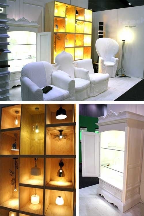
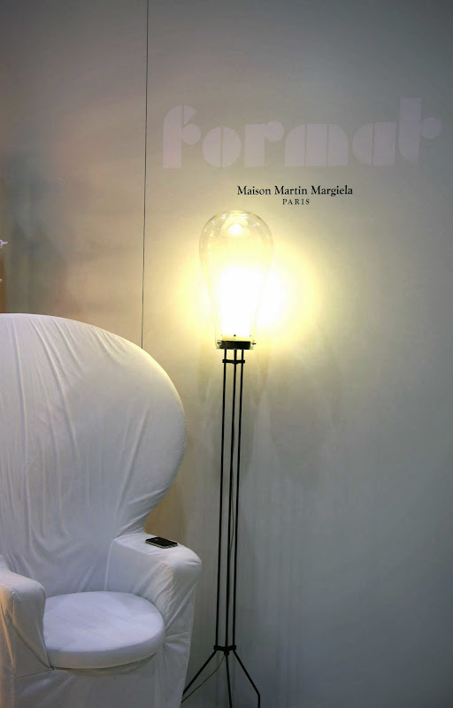
Format Furniture featured the eclectic Maison Martin Margiela Collection (a collection of objects and familiar furniture forms reinterpreted and united with white linen covers) keeping the stand fairly austere and letting the quirky furniture elements do the talking. I really liked the way they displayed the pendant lights - a good solution for something that can be difficult to effectively display on mass.
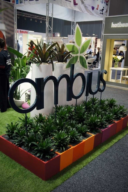
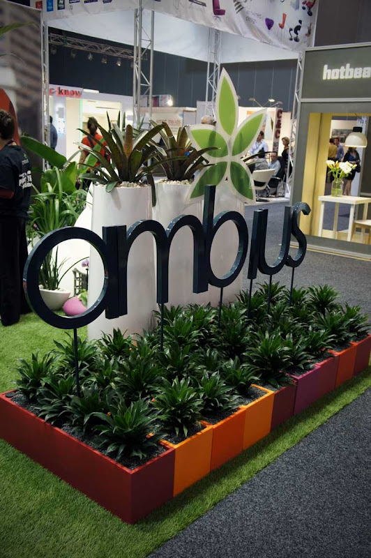
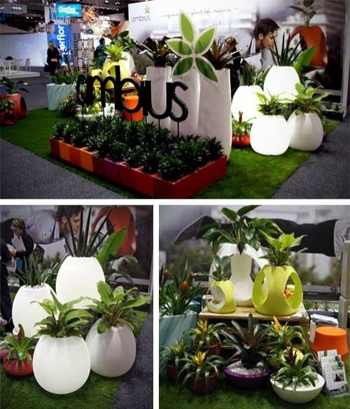 I love a stand where the product does all the work - I think that's the case with the Ambius display. I loved the bulbous shape of the planters that also acted as a soft glow light - how fantastic for your outdoor entertaining area. The Ambius stand had such a fresh look with great product display and bright popping colours.
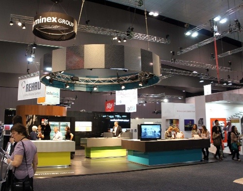 A lot of the large stands were very corporate looking and not particularly creative or inspiring. I think they really let their products down in that way, I know from experience that some serious money is spent on these events and it's wasted when you don't inspire or captivate the people attending the show - designers love to be wowed. Even Laminex [above] was a little uninspiring - a stand I usually look forward to seeing at DesignEx, they seemed to opt for a very conservative approach this time around, I'm sure they had their reasons for doing so but I was disspointed.
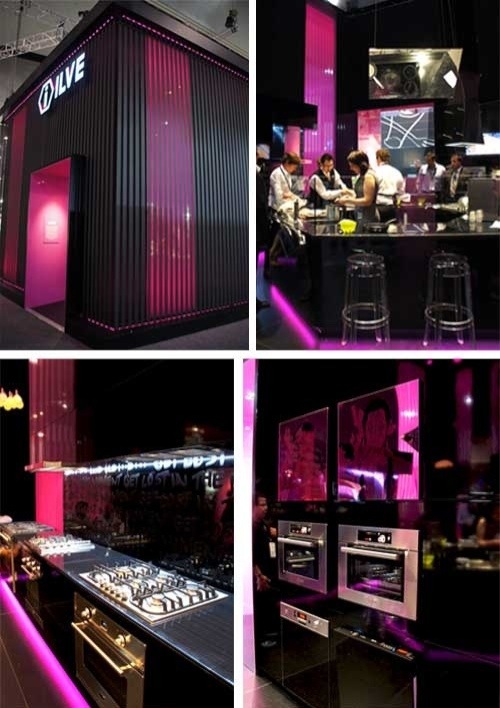 One large stand that I thought was done well was Ilve - they created the drama needed to get the attention of the exhibition visitors. I loved the high gloss finish of the black against the magenta lighting and the follow through of the theme. Although the graffiti aspect is nothing new I still love that look [you can see it if you look closely at the splashback].
Part 2 coming up - with trends and some products I loved...


 I love a stand where the product does all the work - I think that's the case with the Ambius display. I loved the bulbous shape of the planters that also acted as a soft glow light - how fantastic for your outdoor entertaining area. The Ambius stand had such a fresh look with great product display and bright popping colours.
 A lot of the large stands were very corporate looking and not particularly creative or inspiring. I think they really let their products down in that way, I know from experience that some serious money is spent on these events and it's wasted when you don't inspire or captivate the people attending the show - designers love to be wowed. Even Laminex [above] was a little uninspiring - a stand I usually look forward to seeing at DesignEx, they seemed to opt for a very conservative approach this time around, I'm sure they had their reasons for doing so but I was disspointed.
 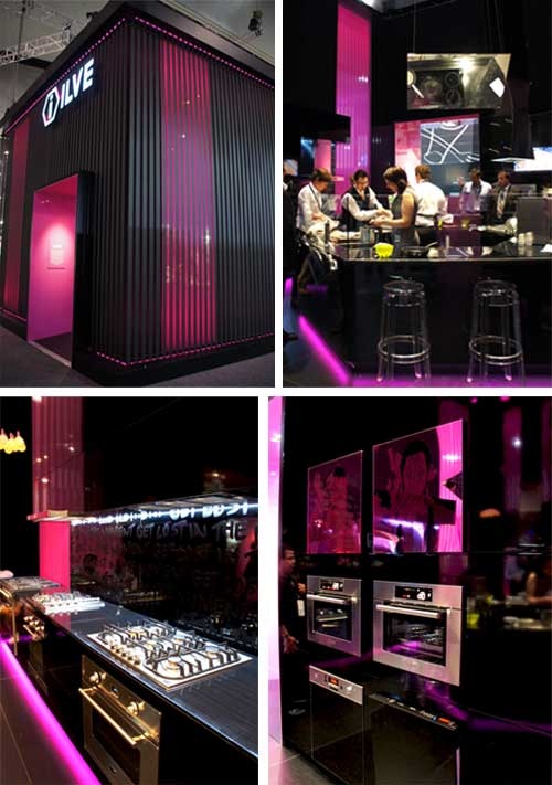 One large stand that I thought was done well was Ilve - they created the drama needed to get the attention of the exhibition visitors. I loved the high gloss finish of the black against the magenta lighting and the follow through of the theme. Although the graffiti aspect is nothing new I still love that look [you can see it if you look closely at the splashback].


No comments:
Post a Comment
Thanks for your comment, we love to hear from you!